- Philippe tends to work in very pure, simple, sculptural forms. How did this sensibility translate into your craft?
Philippe focused on the refined craftsmanship and decorative quality that are distinctive to Owari Shippo. Traditional Shippo decoration often features concrete motifs such as flowers, birds, the moon, and the seasons, but rather than concentrating on the imagery on the surface, he pursued how ornamentation functions within the overall structure, how it harmonizes with form and function, and what role it plays.
Drawing on the inspiration he gained during his time in Japan, he developed simple, beautiful forms. Within those minimal shapes, the meticulous handwork of Owari Shippo coexists with a quiet presence, and I feel that the artisans’ skills and his contemporary sensibility resonate with each other in a very natural way.
- Did you need to adjust anything to meet his design?
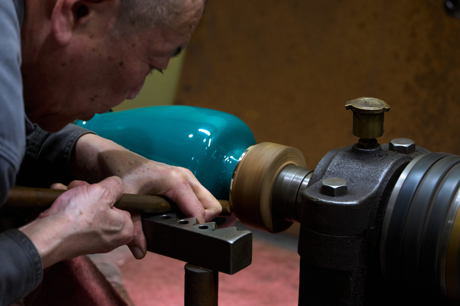
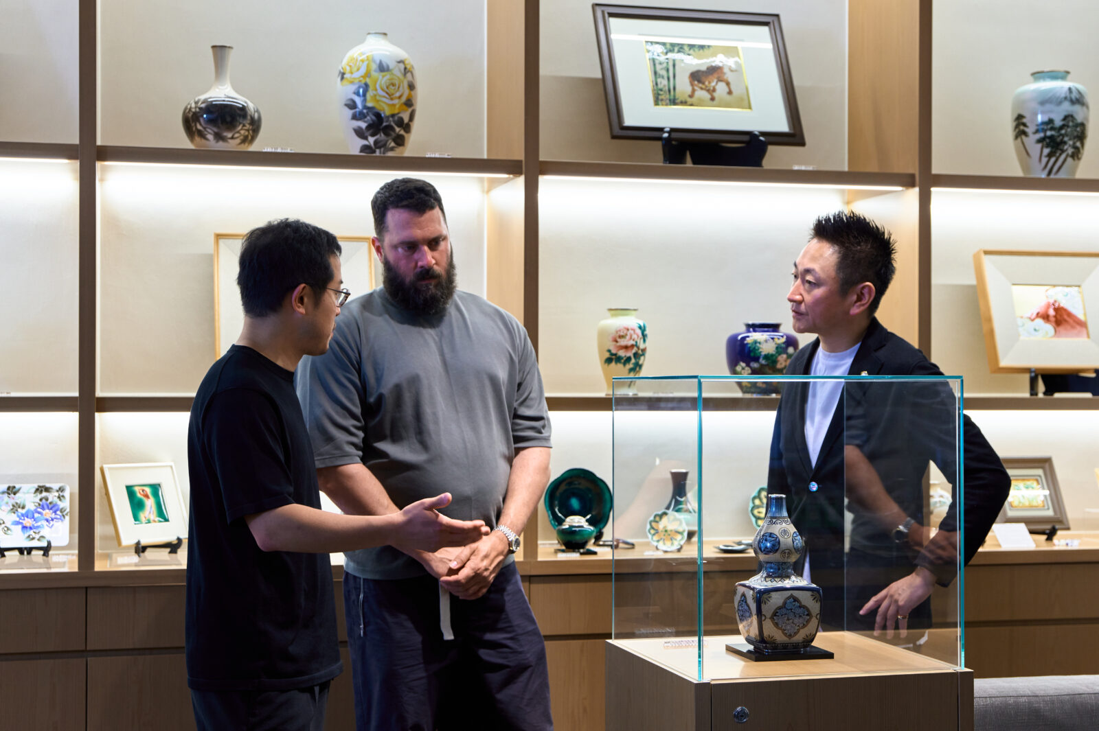
We mainly needed to adjust the form. In cloisonné containers with lids, it is typical to add metal rims afterward at the joining edges, so the fitting mechanism is created by the rims themselves and is not built into the body. In this collaboration, however, the presence of those rims did not suit the iconic form Philippe was aiming for, so we needed to devise a base shape that could provide the same function as conventional rims without relying on separate rims. Because warping during firing also has a major impact on the fit, we had to carefully consider a form that would not compromise the design, as well as the durability of the work when stacked. It was challenging, but in the end I feel we achieved a simple finish with the elements reduced as much as possible.
- What was the most stimulating part of mixing a contemporary design language with Shippo’s deep tradition?
What I found most stimulating was the freedom the work offers: it can be stacked, and you can enjoy it by changing the combinations. That kind of functionality and flexibility feels new for traditional Shippo. As a traditional craft, Shippo is often valued more for viewing than for everyday use. There are historical reasons for this, as Japan already had materials well-suited to daily life, such as wood, lacquer, and ceramics, and Owari Shippo was also treated as a highly decorative luxury item. In that sense, I feel the collaboration overturned that assumption in a positive way. To hold it in your hands, arrange it freely to suit a space, and enjoy it by placing things you like inside, through this project and collaboration, I hope Owari Shippo can be embraced as something more familiar and closer to everyday life.
- How might this collaboration help keep Owari Shippo evolving in the future?
The Craft x Tech collaboration gave us an opportunity to reconsider the relationship between contemporary design and the techniques we have inherited at Ando Cloisonné, including traditional ornamentation. Our company aims to respond to the forms and needs of each era without clinging to old systems, but there are limits to how far truly novel ideas can emerge from within the company alone. In production as well, we can find ourselves prioritizing established methods. Through this project and collaboration, we were reminded that real evolution comes from taking on difficult challenges. I also believe Philippe’s sculptural sensibility will become an essential element as Ando Cloisonné continues to make new proposals going forward.
- Did this very project give you a new outlook on colour, finish, or the expressive possibilities of enamel?
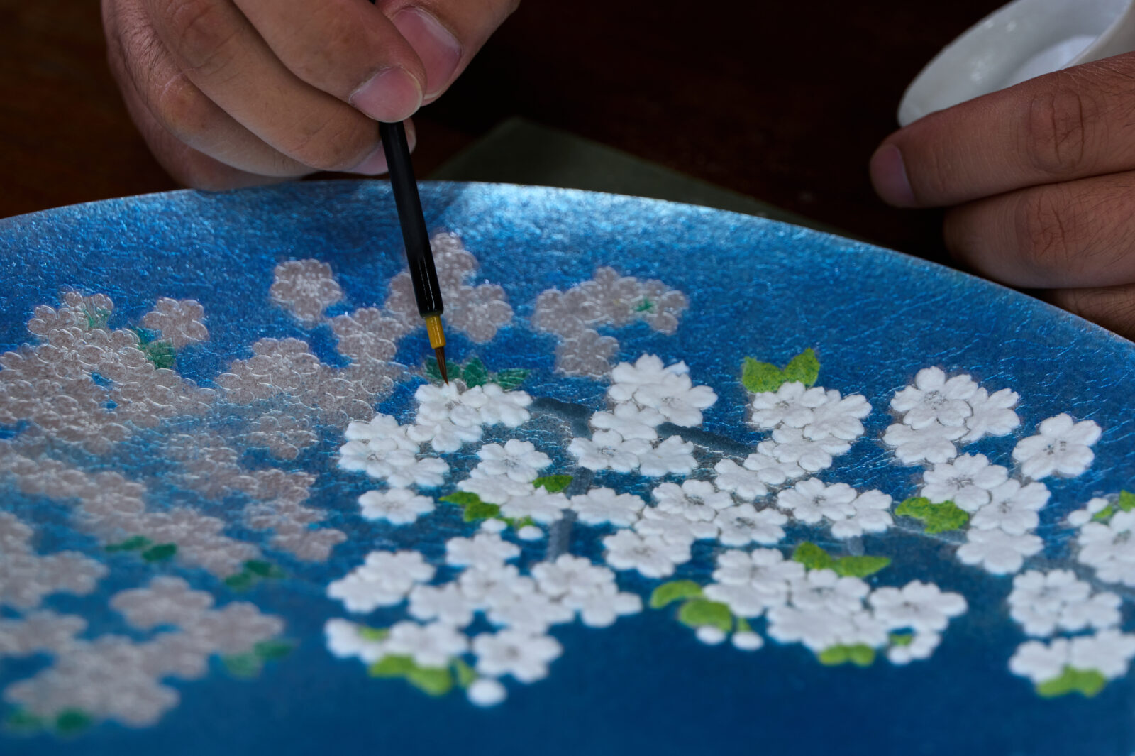
Within the base colour “white,” we used enamels with varying transparency and subtle tonal differences. Typically in cloisonné, multiple enamels are blended, heated, and then ground into a uniform single colour before use. This time, however, we intentionally used the blended enamel as-is, without heating or grinding it, so as to create a more complex texture. This was not a method we had used before, but as we have renewed our in-house team, a new staff member proposed this approach, and it had a significant impact on the work.
The dot pattern also contains a quiet nuance: although it may seem subtle, it actually uses three colours—an understated point of attention that we did not want to overstate. Cloisonné is often associated with vivid colour, so a fully monochrome palette is unusual, but the result retains depth while becoming modern and refined. For us as well, it offered a new perspective and was deeply stimulating.
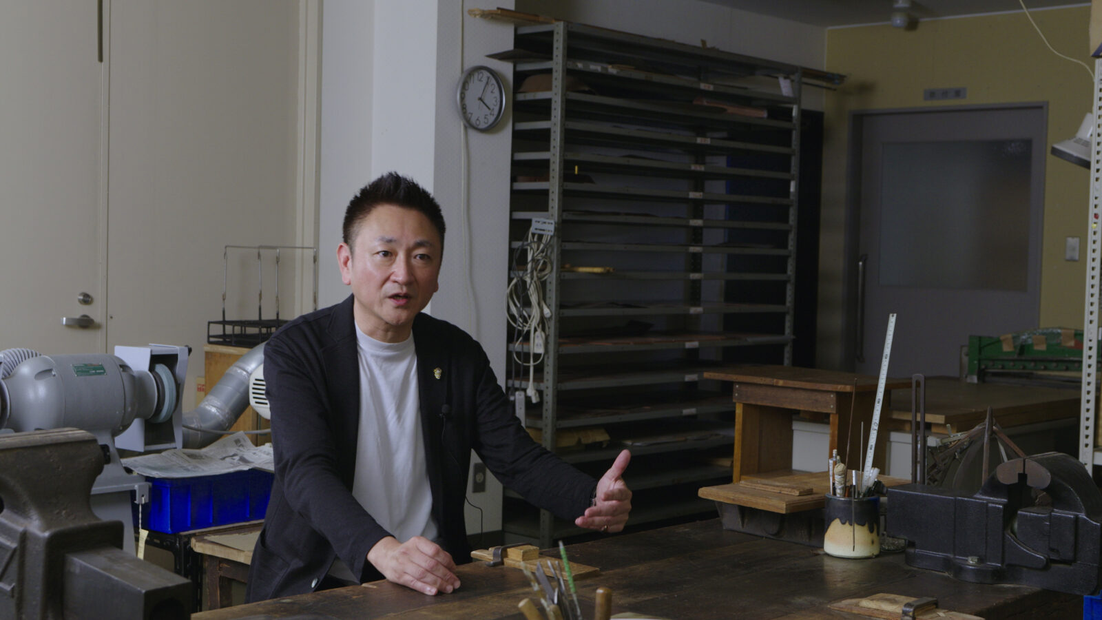
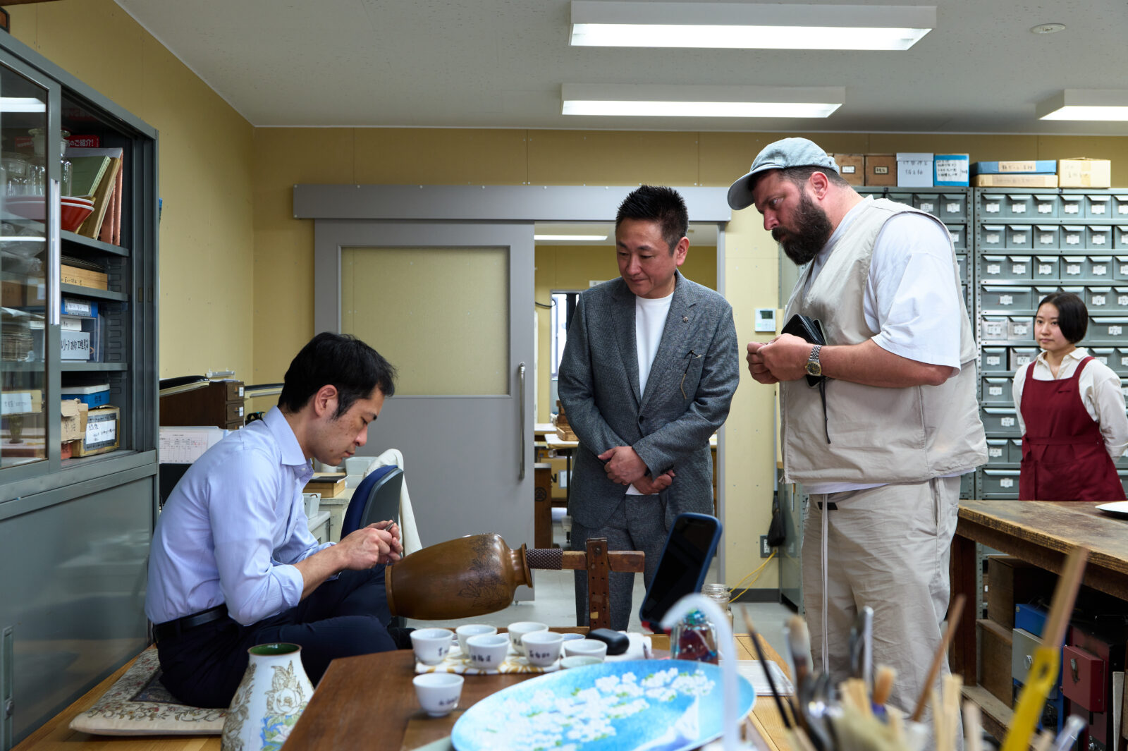
Shigeyuki Ando, Ando Cloisonne (@ando-shippo.co.jp)
[Questions by Maria Cristina Didero]